A Universal Index for Measuring Social Engagement
/
When talking about social media, the conversation usually
focuses around two broad strategies. The first is to work in the medium as a pure
social channel, where engagement metrics define success. The second is to treat
Facebook, for example, like a traditional broadcast medium, where the focus is
really on the size of the fan base and brand-sourced content.
While I believe that many brands preach the former but
practice the latter, even the most well intentioned organizations face an
uphill battle when trying to determine the success and value of their efforts
in social. Social ROI, for example, is
too often judged by direct conversions, and I’m not sure this is the right
metric (especially as Facebook commerce struggles as a whole).
At the very least, attribution reporting, which tracks how various points of
contact contribute to a final conversion in any channel, must figure into the
picture of social ROI (See the “Assisted Conversion” report in Google Analytics
for an example).
Either way, it is an important discussion that deserves a deeper dive in a
later blog post. For today, let’s set it aside and focus instead on the concept
of metrics for social engagement.
There exists a common core flaw in the metrics that are
generally used to measure engagement. The flaw is that nearly all reporting I
see is based on raw counts of engagement interactions. Examples include the
quantity of Likes, Shares, Retweets, etc. These metrics would all be fine if we
consistently worked with the same quantity of followers, but we don’t; as
adoption of social channels and mobile devices continues to climb, it is a safe
bet that even the most dysfunctional brands will continue to attract more followers.
In other words, even brands that hardly try will see their fan bases increase
and, as a result, their raw engagement counts grow.
Here are two specific challenges inherent in using raw
counts for social engagement:
- Inaccurate performance comparisons between two time periods like year-over-year or month-over-month
- Relative inability to compare brands or competitors of differently sized fan bases
The good news: I’ve got one that works especially well for
Facebook. DMW calls it the Facebook Engagement Index (FEI). It is a simple but
powerful metric that allows regional amusement parks to compare themselves to
Walt Disney World, for example, and for brands to measure their engagement
efforts vs. the same time last year. The concept is to measure engagement by
“per fan metrics” instead of raw counts. That is, divide the raw engagement
counts by the quantity of followers. What you wind up with is a consistent range
of percentages that universally defines social success (or failure) in
Facebook.
We have been using FEI with our clients for about two years
now, and have recently begun monitoring other brands as well. I usually find
that an FEI index of 2% to 4% counts as “average”, with an index of 6% to 10%
counting as “very good”. I occasionally see brands reaching an FEI above 10%, but
this is uncommon and almost always temporary.
So what can we learn by using the Engagement Index? For
starters let’s compare Engagement Index over time against quantity of fans. In
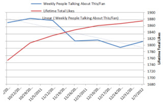
the past two years, DMW has learned that nearly all brands will form an “X”
chart here, where engagement starts high and fan count low. Unfortunately,
the common pattern is that these trends then switch places over time, with
engagement diminishing in converse relationship to growth in fanbase. Although
it’s something to avoid, here’s a common chart:
The goal is to try and keep that Engagement Index trend nice
and level as your fan base goes up. That is, maintain the quality while
increasing the quantity. One of our clients, Center Parcs UK, is superb in this
category. Here’s a sample chart from them:
See that level blue dotted line? It means that they have
grown a fan base that remains consistently engaged despite its size. They have
gained Quantity without sacrificing Quality. It should be the goal of all
brands to have an Engagement Index chart that looks like this one.
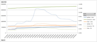
Next, for a brand-to-brand comparison, let’s look at three sneaker brands over the course of
the past four weeks....
Notice that Converse (in green) is, by a long shot, the
most popular of the three brands with over 2 million fans. But look at the
dotted green line, their Engagement Index trend. Floating in the range of 1.5%
to 3%, they are just barely getting into the realm of “average”. Summary:
Converse has a built broadcast channel and probably has a good one million
followers who couldn't care less about the brand.
As a point of comparison, let’s have a look at Adidas (the
blue lines). This brand has a healthy but comparatively modest fan base of just
half a million, but in terms of engagement they are punching far above their
weight. Even discounting for their temporary meteoric rise into the double digits,
they are usually around 5% or 6%. In terms of engagement, they are running circles around the other two brands. Great job!
So I ask you: Who is doing better in social? The brand with
a huge quantity of disinterested followers or the brand with a modest quantity
of engaged fans? There is plenty of room for debate, but my money is on the
latter. I believe it easier to grow engaged fan bases over time than to prune
dead weight away from an already grown community. What’s your opinion?
If you'd like to learn more about DMW's Facebook Engagement Index, please get in touch via the links on the right or via the comments.


